ShopDreamUp AI ArtDreamUp
Deviation Actions


Suggested Deviants


Suggested Collections


You Might Like…


Featured in Groups


Description
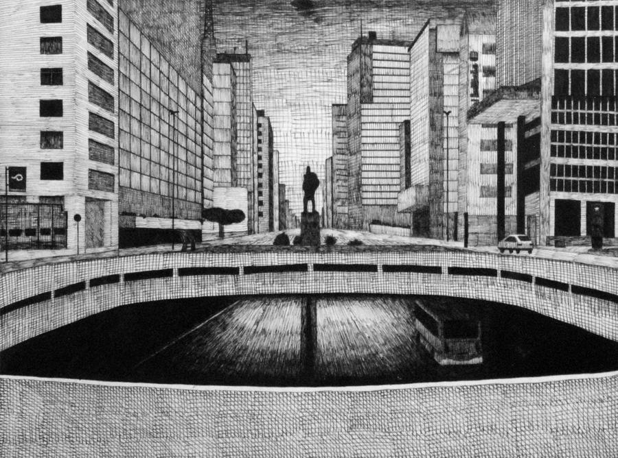
Another college piece. It's a well-known spot of an important avenue here in São Paulo, called Paulista.
Made with felt-tipped pens, two smallest sizes. Also paper photographed, and had levels treated. The damn pen dripped a bit of ink up there, and i hope you didn't notice.
It's been featured in the group #Critique-It so i would like to know:
- What do you think should be improved in this piece.
- What are the strong points of it.
- Any comment about the technical, emotional, artistical aspects are welcome, feel free to give your opinion about what comes to your attention the most.
Image size
3016x2236px 4.22 MB
Make
NIKON CORPORATION
Model
NIKON D80
Shutter Speed
10/40 second
Aperture
F/32.0
Focal Length
52 mm
ISO Speed
1600
Date Taken
Jun 21, 2010, 10:04:20 PM
© 2010 - 2024 marcolgf
Comments9
Join the community to add your comment. Already a deviant? Log In

- What do you think should be improved in this piece.
This naturally depends on precisely what you've tried to achieve with the image. It is clear that you've worked on it patiently, and the fact that you've used a felt-tipped medium most likely means that you must have had a good advance idea of a lot of choices you made.
I wouldn't worry about the ink stain. If anything, I personally find that it brings some marginal, positive tension or rupture, smoke or such, to the image.
Shadows
I cannot precisely know what you've observed in front you while drawing, but the architecture and the objects don't seem to cast too many shadows. Even if it's noon, I'd expect to see some shadows, given the complex architecture and horizontal slabs. Even the topmost vehicle doesn't seem to cast a shadow. I could imagine situations in which high temperature and heated asphalt create this kind of shadowless effect as the heat radiates from the surface. This most likely wouldn't eliminate all the shadows, though.
Perspective
Though the general impression I get from your drawing is that of a perspective-intensive piece, there are areas which make me wonder. For instance, if we take the light-coloured, left-hand building at the foreground, and zoom to the bottom of the building, it seems to me that while the front and the back vertical sides of the windows are of perspectively different heights, the white supporting mid-areas of the wall, between the windows, remain unaffected by the perspective. This contributes to an occasional sense of distortion.
Random notes
On the left side of the drawing, the street sign's round part is slightly twisted to the left.
The scarce vegetation, if more elaborate, could provide a more finished effect. The plants, like the street sign, are now black and without accent, even in their silhoutte. This might also apply to the statue. One might further ponder the reason as to why the plants, the sign and the statue seem black but other objects, like the car, are radically lighted - even though the car isn't necessarily that differently positioned in comparison to the tree-like silhoutte on the left side of the street. One could also consider whether the darkened object actually were so uniformly and totally obscured, or whether only parts of them were.
The light that breaks in the tunnel looks rather good, and gives an almost woodcut-like feeling. One could consider the direction of pen strokes, though, in particular on the left track. The strokes don't precisely follow the orientation of the road. There are many reasons that could entirely understandably lead to this effect, but there's no visual cue available that might help to see the reason. The (mini)bus looks really nice.
- What are the strong points of it.
Generally speaking, the strong points have to do with the fact that you have the patience to follow the lines that dominate urban landscape. There's a diversity of singular lines that point toward the way in which urban areas move beyond the cadre of their planners. Surfaces gather soot, lighting and motion affect the way in which immobile surfaces are perceived. Artistically speaking, the sketchy finish is more interesting than a painstaking, architectural reproduction of the scene would be. It would be hard to find anything to say about an AutoCAD design. I'd draw your attention back to the bus - it's structurally executed but still alive and complexly lighted.
Also the basically simple grids of vertical, horizontal and occasionally diagonal lines that you use to tile various surfaces are nice way to signal motion and perhaps reflecting, complex light sources. I'd imagine that if you are able to work flexibly using this method, then you can use it to preserve a lot of data that you can use later for many purposes and further elaboration.
- Any comment about the technical, emotional, artistical aspects are welcome, feel free to give your opinion about what comes to your attention the most.
I think I've already expressed quite a few points above, sidetracking to answer this question as well. Personally, I don't read this drawing as an 'emotional' work, foremost. I look at it as an interpretation and a note on urban landscape, heavy on relating technical, structural understanding without doing it primarily by realistic explication. My commentary is based on this assumption, and focuses on the way in which this structural orientation informs your choices.